PORKÉLINGO
ROLE & TEAM
Product Lead (End-to-End) | 4-person cross-functional team (research, design, content)
SCOPE & SCALE
0→1 concept product · User research · Information architecture · Prototyping & usability testing | 12 user interviews · 53 usability participants across 4 test rounds · 200+ screen prototype

THE CHALLENGE
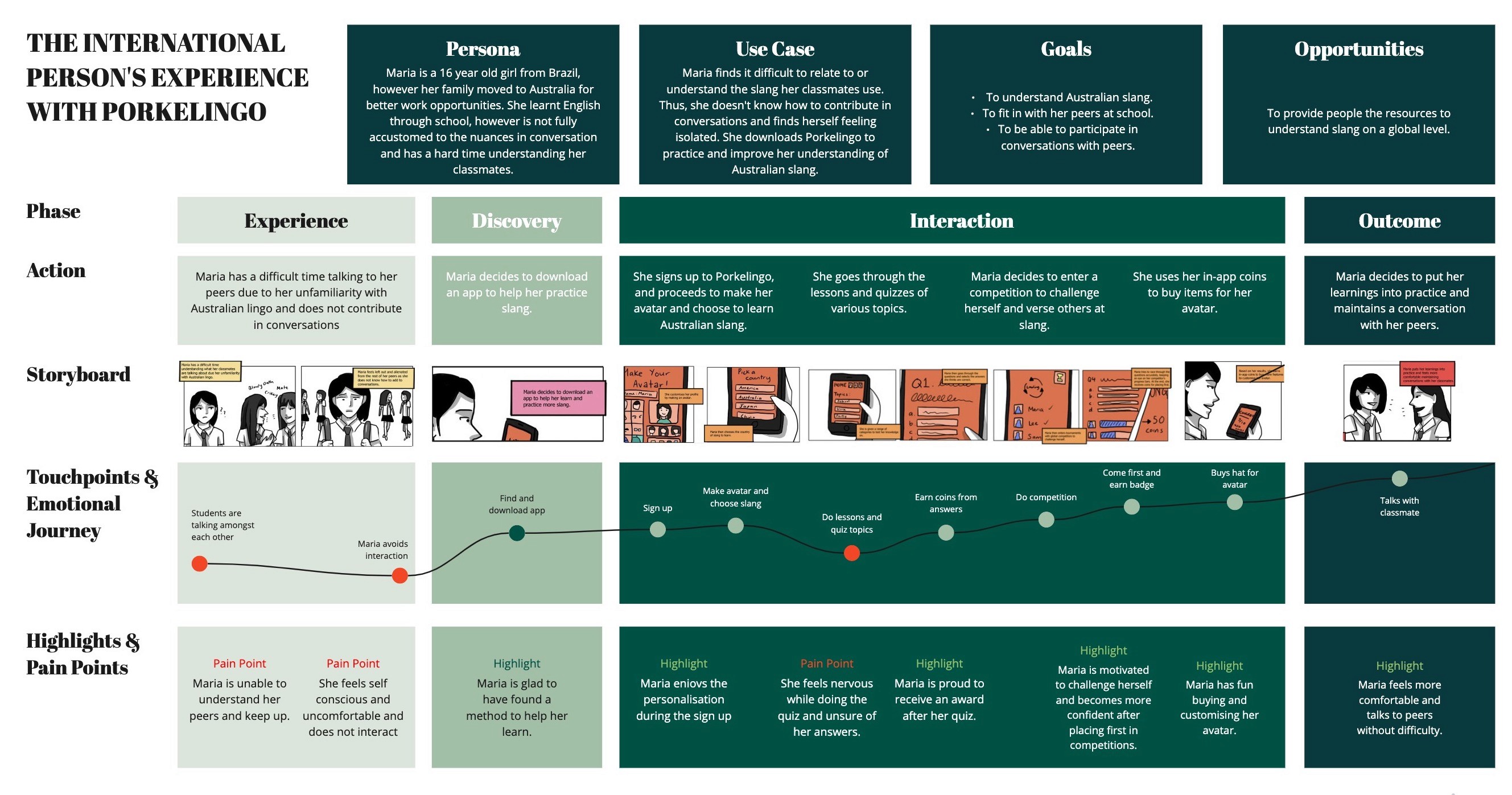
International students and expats in Australia consistently struggle with informal language, slang, idioms, and culturally-specific humour that are never taught in formal language classes but are critical to forming real social connections. The problem wasn't just learning; it was motivation and retention. Existing solutions like Duolingo addressed formal vocabulary but ignored informal cultural fluency entirely, and the few niche tools that tried lacked the engagement mechanics to keep users coming back. The core product challenge had three dimensions: (1) retention - how do you build a habit loop for something as abstract as slang? (2) social proof - how do you make users feel progress before they're confident enough to use it in real life? (3) scalability - how do you build an architecture that can grow its content library without a complete redesign? My job was to define the product strategy that resolved all three.
APPROACH & PROCESS
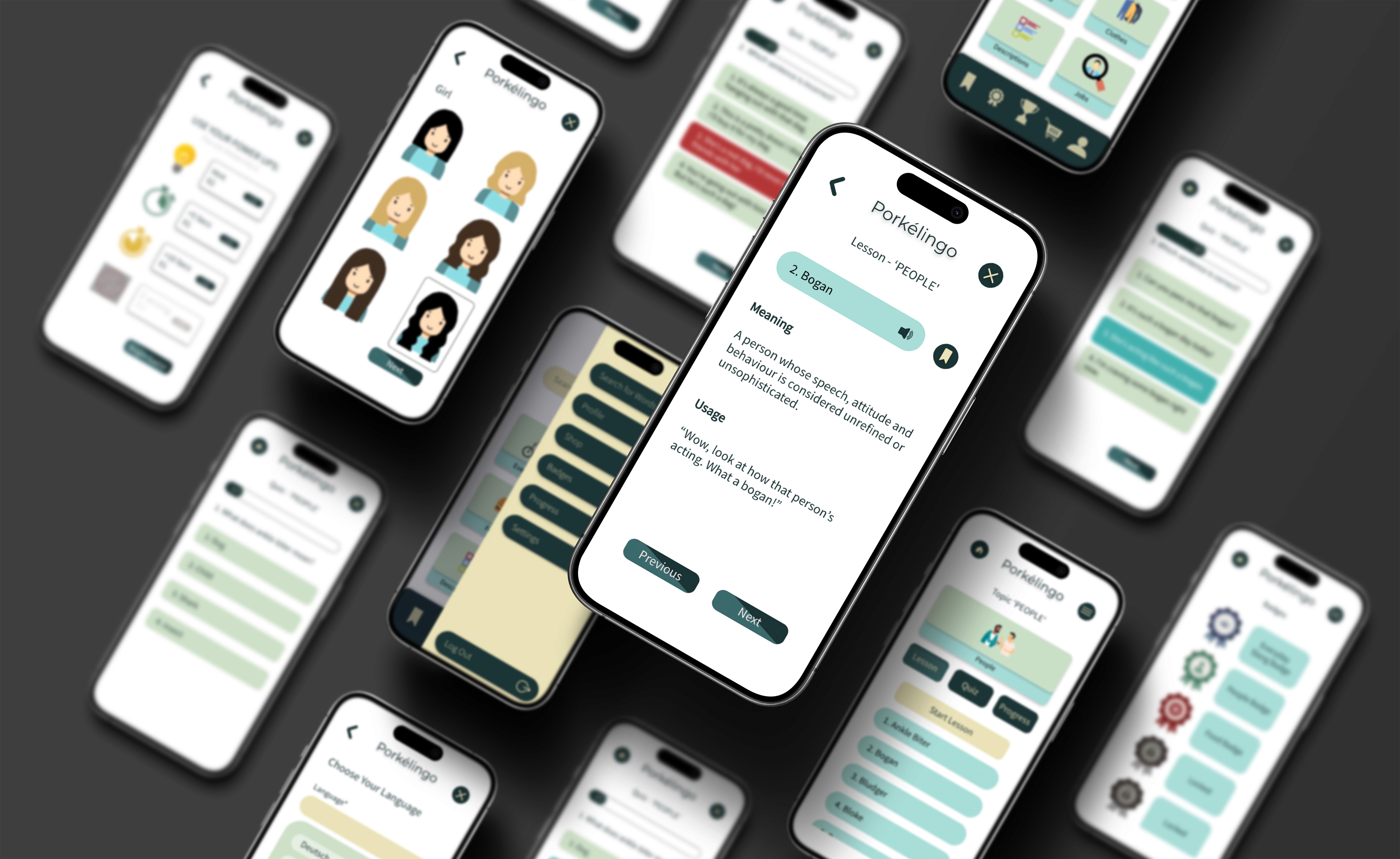
I owned the end-to-end product development process from defining the problem space through to a validated prototype. Rather than starting with screens, I anchored the process in research: we needed to understand not just what international users struggled with, but why existing solutions weren't working for them and what would need to be true for a new product to stick. We ran 12 user interviews and 2 survey rounds with international students and recent expats in Australia. I synthesised findings into personas and empathy maps that the team used as a shared decision-making reference throughout the project. Two insights directly shaped the product strategy: First, users didn't struggle with finding slang; they struggled with knowing when and how to use it appropriately, which Duolingo-style flash cards couldn't solve. Second, motivation collapsed when there was no social element; users wanted to compete with people, not learn alone. These findings led directly to the core product pillars: contextual learning (not definitions), social competition, and a visible progression system. Product Strategy & Information Architecture Using the research insights, I led the team in mapping end-to-end user journeys across four key flows: onboarding, daily learning sessions, quiz mode, and social competitions. The IA work revealed a critical sequencing problem; early concepts put competitive features too early, before users had enough confidence to engage socially. We restructured the onboarding progression to gate social features behind initial learning milestones, reducing the risk of new users feeling exposed before they were ready. This decision shaped the entire feature prioritisation going forward. Using these insights, we created user flows and journey maps to define onboarding, lesson progression, and social features. Paper prototypes and low-fidelity wireframes were used to validate navigation patterns and gamification logic. Moving into high-fidelity design, we focused on visual hierarchy and feedback loops to guide users through tutorials, quizzes, and competitions. Prototyping & Early Validation Before investing in high-fidelity design, I prioritised low-fidelity testing to pressure-test our navigation assumptions and gamification logic. Paper prototypes revealed two early problems: users expected a home dashboard (we had designed a direct-to-lesson entry), and the reward mechanics weren't visible enough at the point of completion. Both were addressed before moving into high-fidelity design, avoiding significant rework. Iteration & Usability Testing We ran four structured rounds of usability testing across 53 participants, using think-aloud sessions, task observation, and heuristic evaluation. Each round had a defined focus area: Round 1 tested core navigation and onboarding flow; Round 2 focused on gamification clarity and reward comprehension; Rounds 3 and 4 validated iteration quality and measured improvement against Round 1 baselines. Key changes driven by testing included: simplifying the onboarding, redesigning the badge system after users couldn't identify what they'd earned or why, restructuring the quiz flow after users repeatedly expected a review screen before submitting answers and a complete UI redesign following feedback regarding the trustworthiness of the app. The final prototype comprised 200+ screens with embedded micro-interactions and progression mechanics refined across all four rounds.


OUTCOME
Outcome & Reflection By the fourth round of usability testing, participants completed the onboarding flow with minimal guidance and navigated the quiz and competition features without prompting, which was a significant improvement over Round 1, where the majority required clarification at multiple points. Task completion rates and time-on-task improved measurably across each iteration, validating the core product decisions. The project demonstrated that a structured, research-led product process, even on a concept product, produces meaningfully better outcomes than starting with screens.