IDENTITY SYSTEMS
OVERVIEW
This collection brings together logos and branding designed across corporate strategy initiatives, digital products, emerging consumer brands and more. Each logo was developed with a strategic foundation, attempting to align visual language with intent.
TOOLS USED
Photoshop, Illustrator, Indesign, Figma

PROJECTS
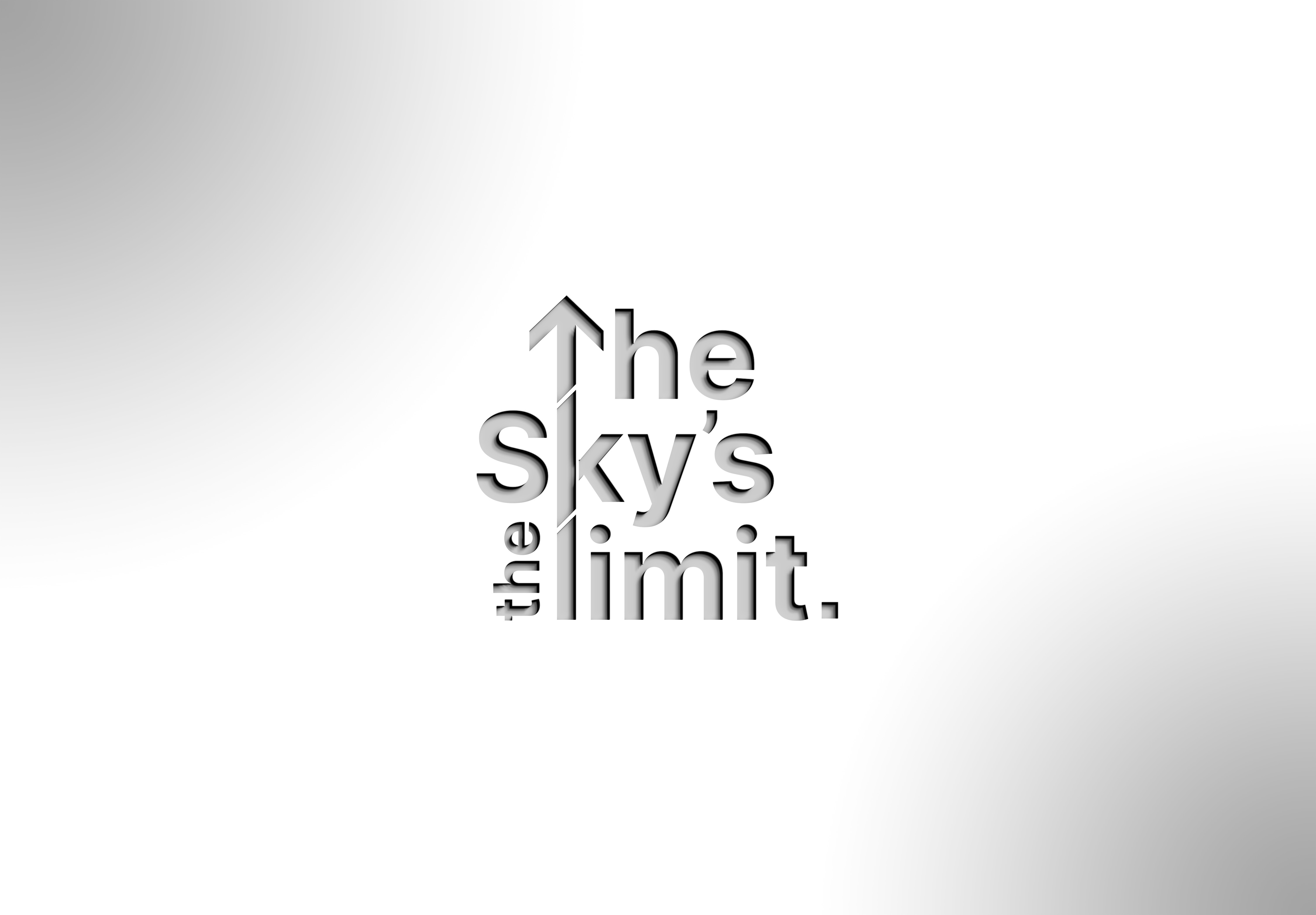
1. AMERICAN EAGLE Industry: Fashion This redesign explores a more symbolic interpretation of the American Eagle identity. The eagle is distilled into an abstract eye form, representing sharp vision and confidence, which are qualities associated with the brand’s adventurous spirit. The flowing curves mimic the natural contour of an eagle’s eye, while the line work creates a refined and modern mark suitable for apparel branding, digital platforms, and retail applications. 2. THE SKY'S THE LIMIT Client: Raine & Horne – Incentive Program Created for a performance-based incentive initiative, this identity captures ambition and upward potential. The visual incorporates elevation cues, aligning it with the align and accelerate branding. 3. DRAWEAR Industry: Fashion The logo explores expressive typography with strong character to reflect a streetwear-inspired identity and quick fashion. Drawear is a subscription-based online service (SOS) that provides a customised box of merchandise directly to the consumer’s home for a weekly/monthly subscription fee. The intention was to create something that could be a brand mark and wearable. 4. FORCAM Industry: Beauty Services Forcam was designed to feel refined and contemporary. The identity focuses on elegance through typography and clean spacing. The brand is inspired by someone close to the business owner, named Cam. The overall branding leans into calm and minimalism.


5. OUR BROKER Industry: Financial / Broker Services Three distinct logo directions were developed to explore traditional trust while creating a modern look. Each concept tested typography and visual cues. 6. &THRIVE Industry: Self-Care / App whitelabel Client: Raine & Horne &Thrive is a wellness-focused app identity centred on self-care. The ampersand represents the connection to Raine & Hore, and the 2 arcs signify protection. 7. ACCELERATE+, KNOWLEDGE HUB & APG Client: Raine & Horne – Internal Initiatives These internal initiative marks were created to visually systemise organisational programs under a cohesive design language. Each logo maintains individual character while adhering to a shared typographic and structural system, ensuring recognition and connection to the parent brand. 8. ALIGN & ACCELERATE (A&A Icon) Client: Raine & Horne – Business Plan Initiative Align & Accelerate was developed as a strategic business framework to unify direction and growth goals for the next 5 years. The A&A icon was constructed using directional geometry to symbolise momentum while maintaining association with the larger umbrella.

